click to go home


College of Graphic Arts Concept Branding
What would a progressive and modern graphic arts university look like?
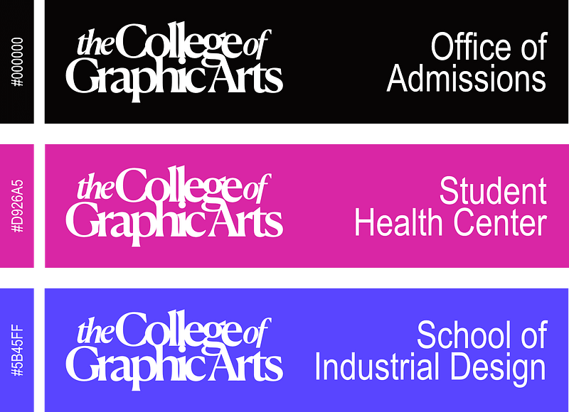
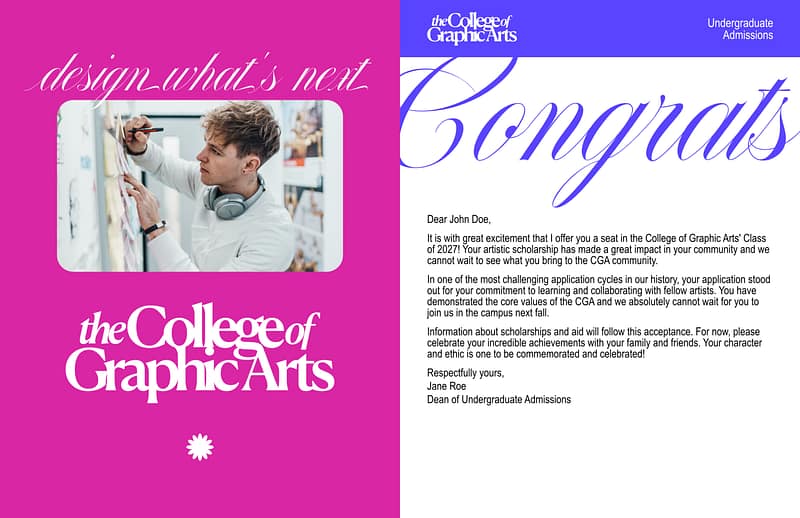
Taking the simplicity needed for such a large scale branding challenge, I decided to combine a classic serif font to adorn the institution. Colleges are supposed to be serious communities of educators, learners, and researches. This is a challenge when designing a logo that is supposed to represent a College that wants to cater to a modern student body.
The mixture of the serif and the condensed sans serif is a great example of the branding taking careful liberties. The condensed font provides a simple and legible way of taking a risk with the typography.
Created using vector graphics software (Affinity Designer) and pixel-based software (Affinity Photo). This is a concept and not used by any institution.